Dental Select Headquarters
rebels
Dental select headquarters
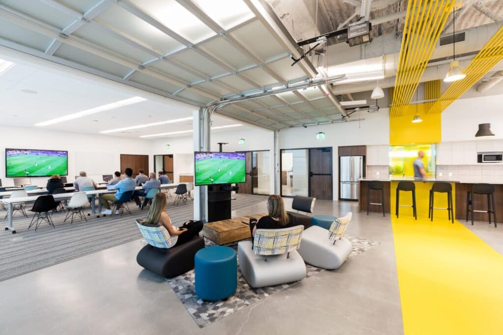
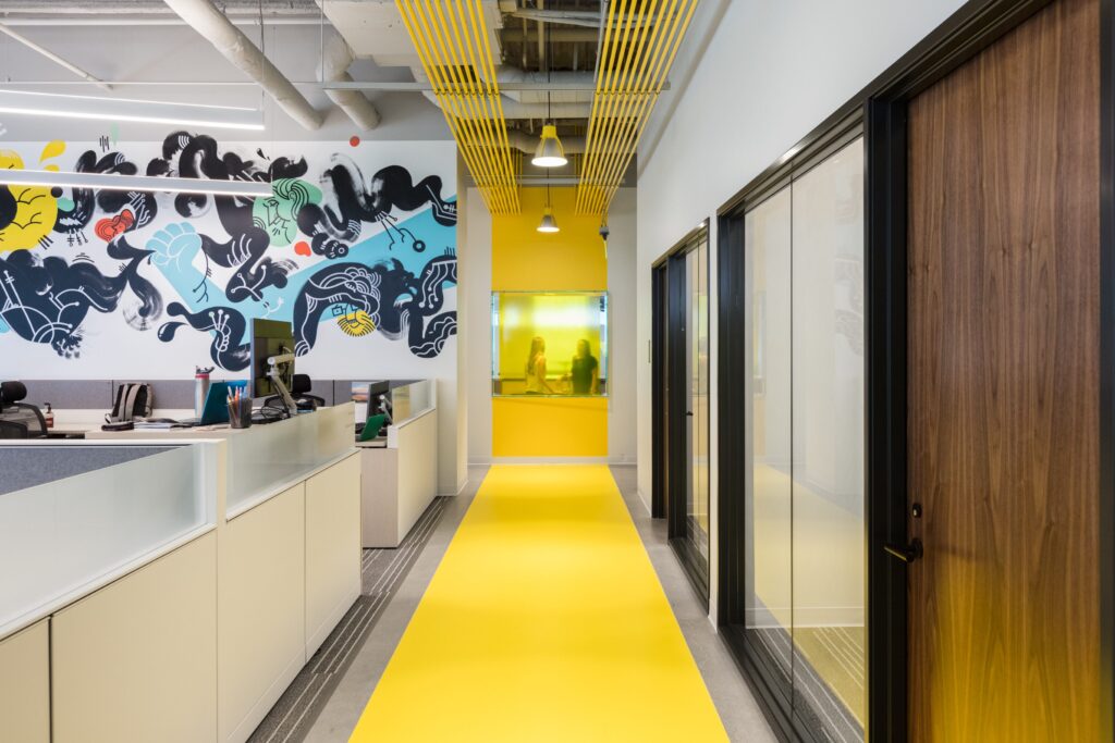
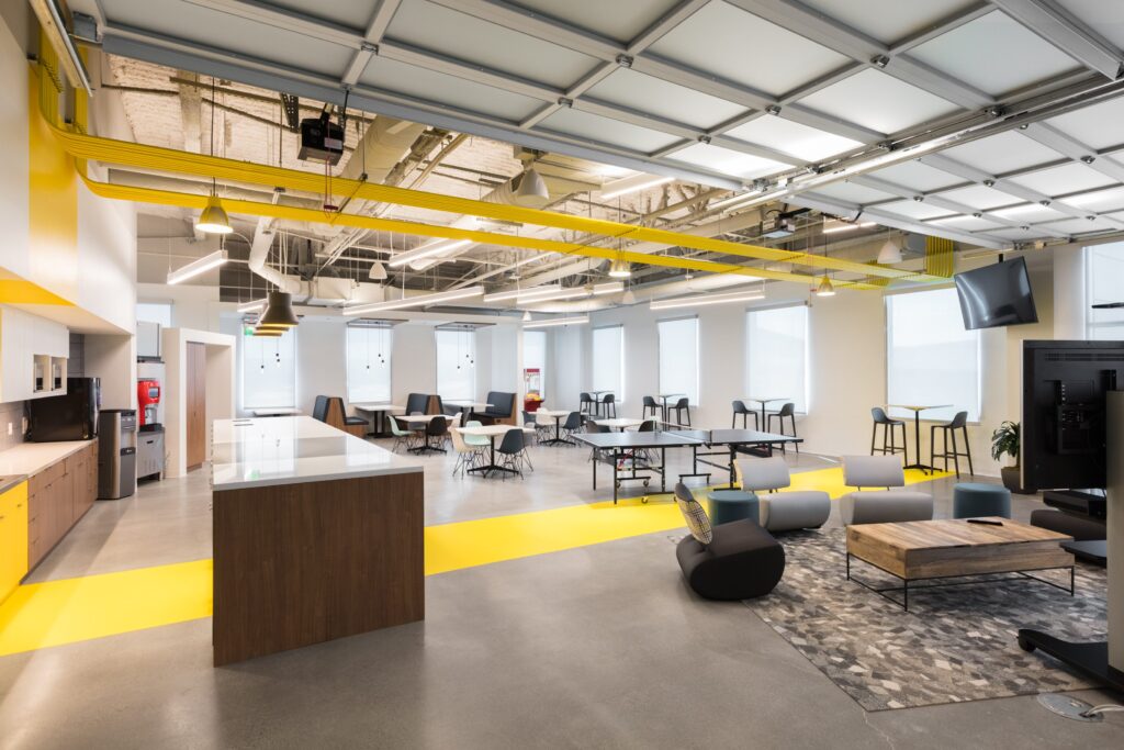
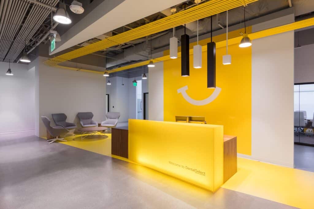
The client wanted a space that embodied the organization’s approach to business and their internal culture—evoking a “simplicity that makes you smile” and leaving visitors with no question that the space is home to a group of clever rebels that make noise, ruffle feathers, and get things done. The design team worked to increase efficiency to free up space for more amenity spaces – a key goal for employee recruitment & retention. Spaces are flexible, serving more than one purpose. Clean, purposeful lines create continuity and flow, some positioned in the middle of major pathways as a strategic way to provide “elevated disruption” – a key visioning concept. A “sunny yellow” brand element reinforces identity and aids wayfinding and circulation. The organization wanted a transparent environment that does away with the sequestered executive office model to build trust and provide direct connections. Sustainable elements include maximized views and daylight, low VOC emitting materials, and dimmable LED lighting. The project was executed on a tight schedule and budget, thanks to Method Studio’s scrupulous project oversight throughout the project.
square footage
22,802
construction cost
1,605,171
services
interior architecture,
interior design,
branding + wayfinding


